As most of us know, getting your business users to get engaged with web analytics can be a challenge. You can send them Google analytics reports, create endless dashboards or do extensive monthly reports and recommendations.
Sometimes the trick is making it simple, but adding a dash of insight. One method we use at Digital Insight Labs is to use information graphics. Yes, we do the homework by creating dashboards and extensive reports. After that process, we use a tool called Venngage to create these dashboards. An example of one is below.
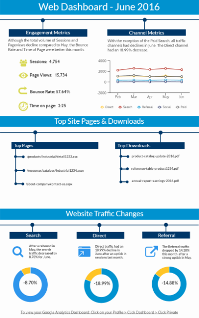
With this tool, we high the high points of what happened in the last month. We take a look at the most important channels and elements on the site. Giving someone an idea of what happened to their Direct and Search traffic helps them understand ongoing changes. We also highlight the top performing pages and documents on the site.
We also provide access to dashboards created in Google for all of the users. This link allows us to create some additional engagement. When the user is ready, there is more data . . . and more reports.
If you are interested in exploring Analytics Information Graphics for your team, contact our team today >